I spent the last few days searching for this before I came across an article sent to me by a Rabbi friend who actually lives in Israel. In it, it lists the names and ages of every verifiable victim and, as I predicted in an earlier post, 75% of the names are men between the ages of 18-35, or on other words, Hamas soldiers. Here is the chart below.

And before I hear from some idiot that this is all Israeli propaganda, the information comes from Al-Jazeera. Here is the link:
http://www.aljazeera.com/news/middleeast/2014/07/gaza-under-seige-naming-dead-2014710105846549528.html
So where in blazes does the MSM get off telling us the dead are innocent victims, instead of Hamas fighters which a majority, in not all, of the men in this category are a member of? Just because they don't wear uninforms does not make them innocent in all of this.
And then we have the UN, which is hardly pro-Israel at all anymore, which keep lying about Hamas fighters not using their "safe zones" as staging areas and weapon caches. Two schools bombed by Israel where found to contain stored weapons inside or rocket launchers destroyed outside the compound. The UN is either complacent in this lie or willfully stupid. And the American people are buying it.
And then there is the economy which is fading fast, not that the MSM would tell you that. This is from Investment watch about how bad the unnamed economists Wall Street and the government hire as mouthpieces really are.
New home sales during June
really hit the skids, posting a 8% decline from May and a 11.5% drop from last
June. In whole numbers, the print came at a
paltry 406,000 annualized rate compared to Wall Street expectations of
475,000.
The interesting thing is not
simply that the Keynesian Cool-Aid drinkers who pass for Wall Street economists
got it wrong again. Actually, as can been seen clearly in the chart below from
the Wall Street Journal, the June 2014 number for new home sales was exactly the
same as the 400,000 number posted right after the financial crisis
in the fall of 2008.
This is the same housing market we keep being told is on the rise. In some areas, like here in the Northeast, it is improving slightly. In the south and the west however, results have been beyond dismal and still fading. This chart shows how bad things really are.

So, we have improved only a nanometer better than before the crash and for that, we should be thankful? I doubt it. And those same numbers say a decline is inevitable as fewer and fewer people are buying housing to live in, and as much as 40% of the market is for flipping, most of it at the million dollar level. How long do you think that will continue?
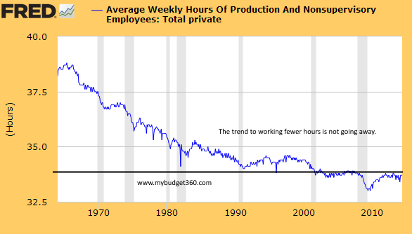
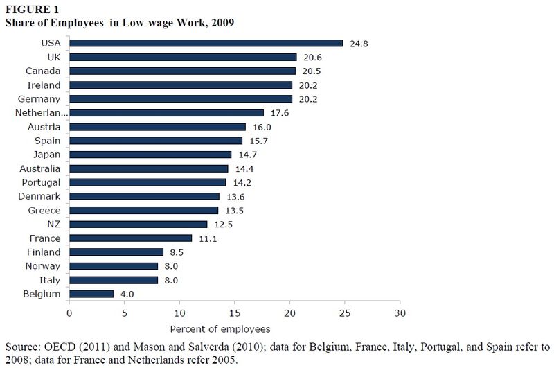
Lastly, we have the media and CEO's blaming Obamacare for the loss of full time jobs. I personally experienced this same thing way back in 1999 and 2000 so I knew that this was a lie. This chart below shows that since 1970, part time work has been growing, and Obama was like 6 when this started, so I doubt he is the culprit, no matter what the Tea Party says.

Notice that it was George W. Bush again that started this trend really growing in 2000 which shows no signs of ending and is actually getting worse, although Reagan, Bush and Clinton also helped it along to be fair. Here another that shows the US is number one in the world for part time, low wage help, and this is from 2009, or pre-Obamacare:

The end result is we have a media completely devoid of reality or truth telling on all levels. Swell.
No comments:
Post a Comment